
Mobile game and app companies are overflowing with vast amounts of data. To make sense of this data and derive actionable insights, analytics platforms such as Devtodev have become indispensable tools. They provide a whole range of data visualization tools for analyzing big data, and various graphs and charts are one of them.
In this article, we will explore some of the problems users may face when they analyze a mobile app or game and the different types of graphs and charts that can be employed to help them extract meaningful insights from extensive datasets.
Why is Data Visualization Important?
Data visualization on analytics platforms is a powerful tool that transforms raw data into easily understandable visual representations. This approach not only facilitates more informed decision-making but also enables data-driven storytelling, making it easier to convey findings to colleagues and higher-ups.
If you have a mobile app or game, consider using the Devtodev platform for data analysis and graphical presentation. Devtodev allows you to identify complex patterns, trends, and relationships more comprehensively and quickly than through traditional data tables.
Data Visualization Tools
Let’s look at the most common data visualization tasks and how analytics platforms deal with those issues.
Problem: I want to track the dynamics of session length in the application over a period in order to quickly respond to its decrease or increase. Additionally, I want to correlate these metric changes with the application's release cycles.
You can use a simple line graph. This is a fundamental type of graph, which is used to represent quantitative data collected over a defined subject and a specific time period. For instance, in game development, line graphs offer valuable insights into player behavior, game performance, and various essential metrics.
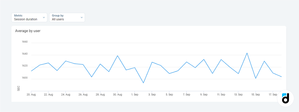
This graph displays user sessions on the Devtodev analytics platform. It highlights the dates when the average session durations were at peak, as well as the dates when they declined. You can conduct an analysis of the events and factors associated with the days when the metric dropped and investigate the reasons behind the periods of increase. Easy and clear.
Problem: I'd like to create a visual representation of the days during the past week when users conducted the most transactions.
In this case, a simple bar chart is the ideal choice. Bar charts are well-suited for representing categorical or discrete data, where categories are distinct and not necessarily ordered in a continuous sequence.
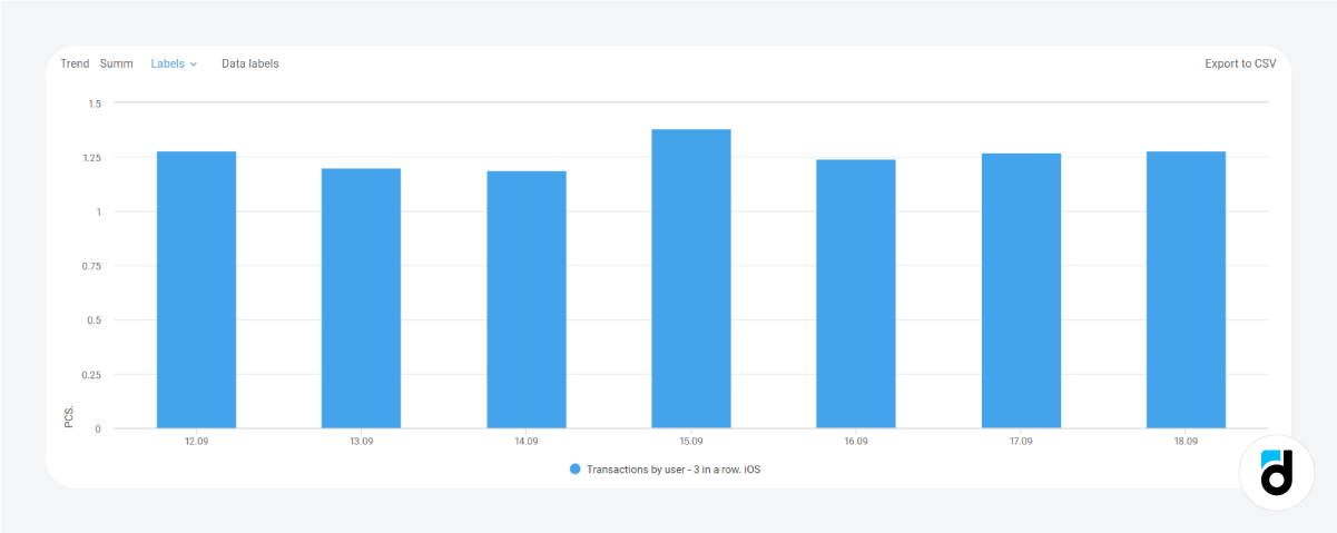
In the screenshot, we see data spanning several days, depicting the average amount of money spent by a user in our game. It is evident that the highest expenditure was recorded on September 15. We can conduct a thorough analysis of this spike in spending if the cause is unknown.
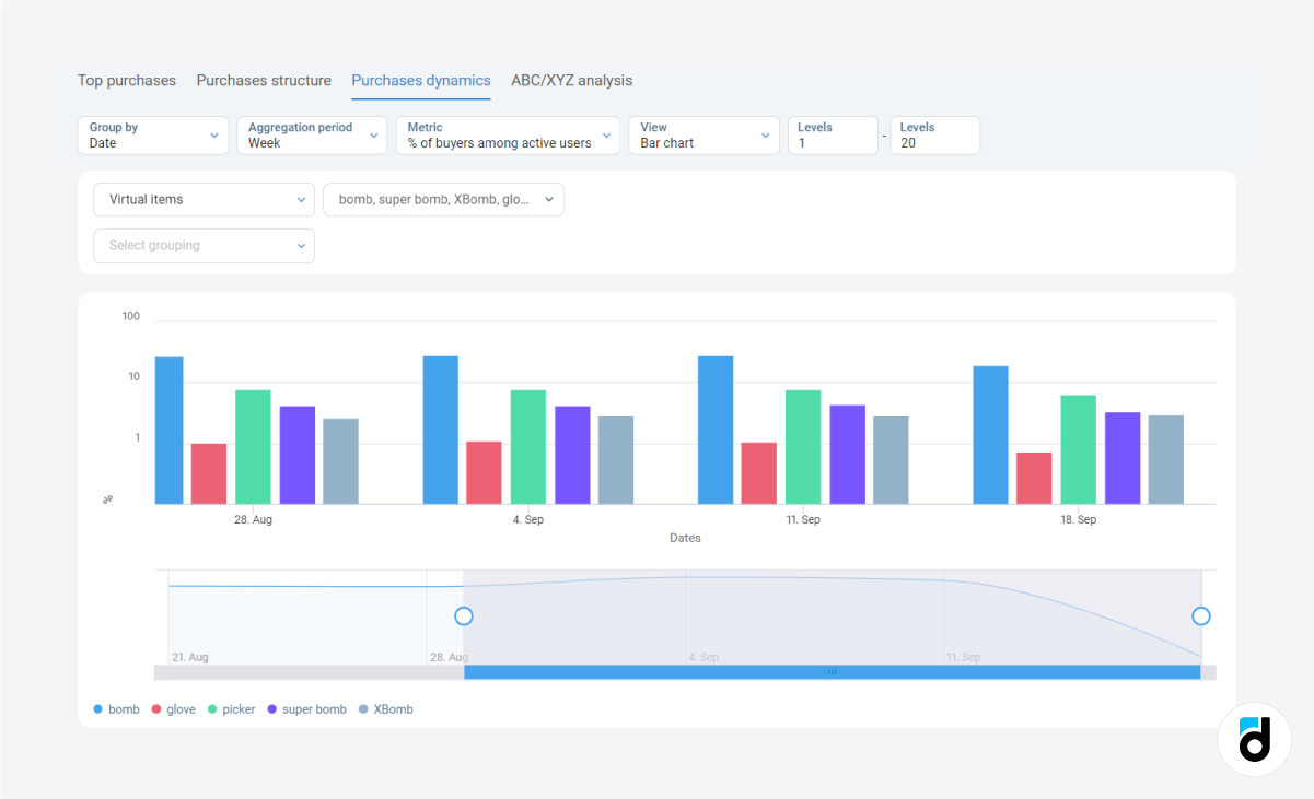
Furthermore, we can use a similar visualization to examine the percentage of gamers purchasing various in-game items. The data shows a stable demand trend, eliminating the need for further in-depth analysis. This type of visualization is not only informative but also time-saving.
Read our free ebook 'In-game Store: How to Boost your Revenue'
Problem: I want to display the categories that make up the audience of the project and nd illustrate that one of these categories represents a significant majority.
In this case, consider using using another data visualization tool - either a pie chart or a donut chart. These visualizations are effective tools for illustrating the distribution of subcategories within a whole, providing a clear and intuitive way to comprehend proportions and percentages.
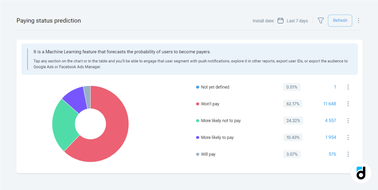
In this particular case, you have five distinct categories of gamers categorized by their purchasing capacity. A quick glance at the chart reveals that the majority of your players are not making in-game purchases. To enhance your revenue, it's essential to reevaluate your user acquisition strategies.
Read more: 4 Simple Methods of Paying Audience Segmentation
Problem: I want to display the dynamics of in-game virtual currency acquisition and spending to visualize the distribution over the course of one month.
In such cases, consider using stacked bar charts or stacked area charts. These types of charts excel in displaying compositions and proportions, helping you grasp the relationships between different components and the whole dataset.
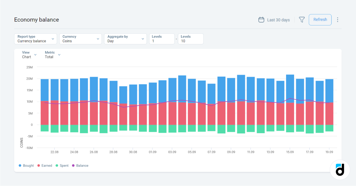
Take a look at the screenshot above. It's highly convenient to use a stacked bar chart to monitor changes in the balance of various types of currencies. This chart allows you to identify when players experienced declines in purchased, earned, and spent currencies, enabling you to analyze their behavior and the game's fluctuations on specific days more effectively.
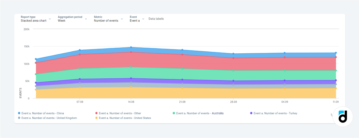
Similarly, stacked area charts serve data visualization purpose well. They are also ideal for illustrating data compositions and showing how individual components contribute to the whole
The example above showcases an analysis of in-app purchases made in the top five countries where users make the most transactions. It's incredibly useful to see which countries have the highest number of purchases.
Read more: RFM Analysis for Customer Segmentation
Problem: I need to visually represent user segments based on their payment frequency, recency, and spending levels, so that I can subsequently interact with each segment individually.
This scenario is quite common because we recognize that user behavior varies significantly, and not all users make frequent or substantial purchases. Hence, it's essential to develop unique approaches for each customer group, but first, we must establish cohorts. The best way to do this is through RFM tree map.
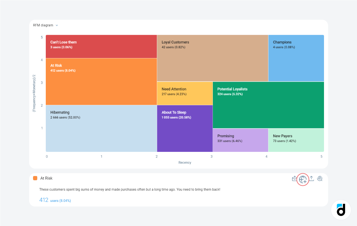
In the screenshot above, you can see the entire audience of a game segmented into ten groups based on the recency, frequency, and monetary value of their purchases. Notably, over half of these users made their last purchase a considerable time ago. This indicates the need to re-engage them with compelling offers. To achieve this, you can leverage the features provided by Devtodev – simply click on the corresponding segment, create a tailored audience, and then send them enticing push notifications.
Read more: Top 12 User Engagement Metrics for Mobile Apps
Problem: I want to track how users of my mobile app navigate from point A to point B.
The most effective visual solution for this is to create a flowchart. It provides a visual representation of the user experience, navigation pathways, and functionality.
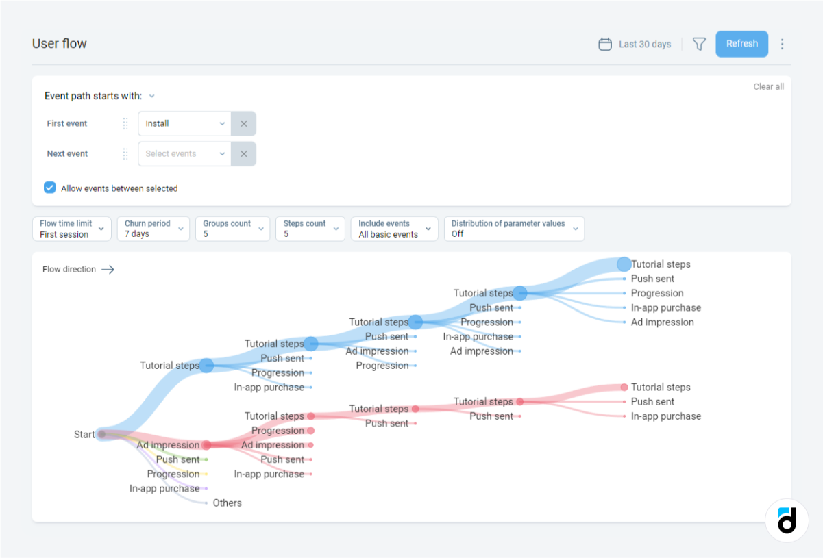
In the above screenshot from the Devtodev platform, you can observe all the steps users take following the installation of the app, marked as the 'install' event. While this is a generalized map, it serves as a foundation. You can also monitor user actions leading to in-app purchases, level advancements, or any other events. In such cases, you would need to configure custom events.
Read more: SQL for Beginners: In-App Purchase Structure
Problem: I'd like to illustrate the percentage of users who progress from onboarding to placing an order and highlight the specific key step where the most significant user attrition occurs.
This can be better visualized through a funnel chart, which looks as follows:
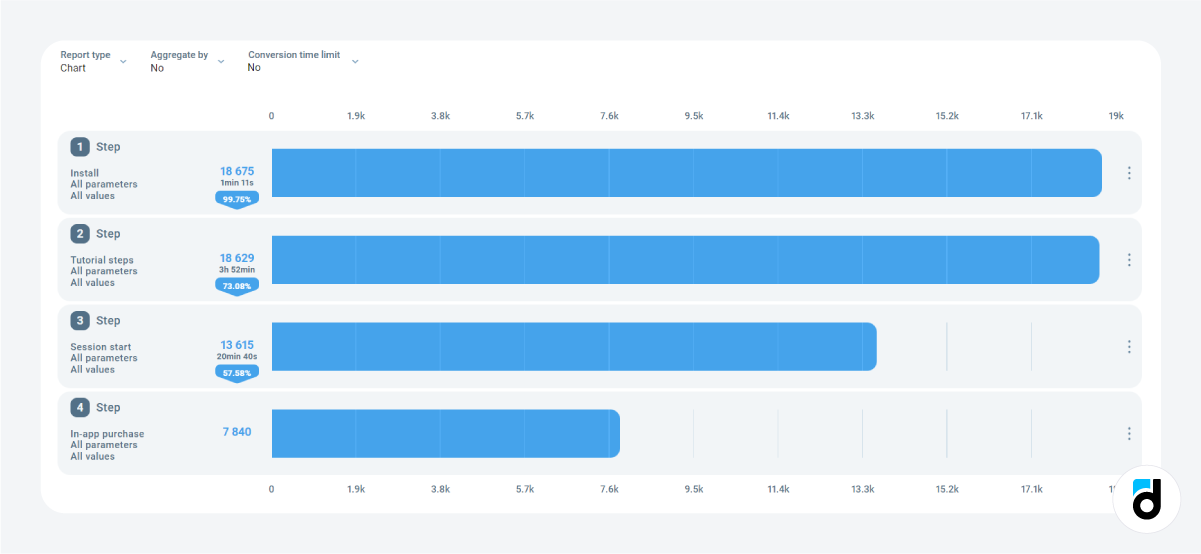
For this visualization, we have selected the following key steps: app installation, tutorial completion, session initiation, and the ultimate goal – an in-app purchase.
In addition to displaying the percentage of users who have successfully reached the final goal, Devtodev also provides valuable insights into the actual number of users who have accomplished it and the time it took them to complete each step.
Read more: Color Code you Data to Simplify Interpretation and Enhance Analysis
Problem: I have a substantial amount of data, and I need to visually emphasize critical insights using specific criteria. For instance, I want to promptly identify the country with higher payment rates and an increased number of active users.
In such situations, you can create a straightforward table and implement conditional formatting.
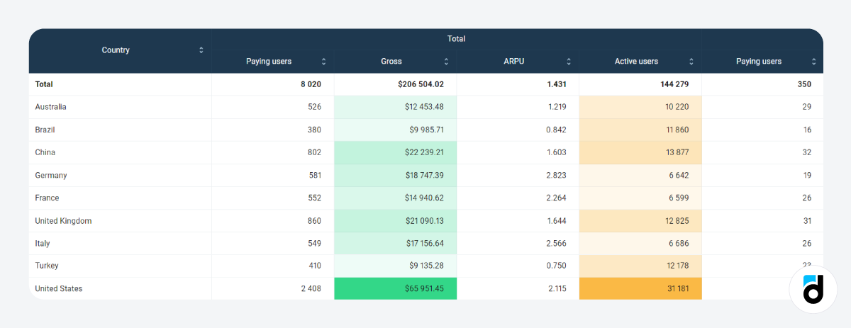
In this particular scenario, it's evident that the United States accounts for the most substantial portion of the game's gross revenue and boasts a large number of active users. Other countries provide a smaller number of users and generate significantly less revenue. Analyzing data like this enables you to identify the most promising audience for your upcoming ad campaigns.
More Choice with Devtodev
In some of the Devtodev's reports (e.g. all reports of the Basic metrics section, the Custom events report, etc.), you have access to a variety of chart types, ranging from straightforward tables to more advanced options like stacked bar charts. This versatility is highly convenient, as it enables you to present your data in a manner that facilitates the most effective analysis.
But that's not all. You also have the ability to incorporate these graphs into your dashboard, save them, and leverage them for various purposes, including generating reports for higher-ups. This feature enhances your data management capabilities and empowers you to make data-driven decisions with ease.
In summary, charts make your data clear, usable, and actionable. To employ an array of tools, including a wide range of charts, you can use an analytics platform such as Devtodev. It simplifies the analytics process and allows you to focus on what matters most — creating amazing experiences for your users and driving your app or game to new heights.