
Imagine yourself as the application project manager. You know how important analytics is in project management and regularly track your product metrics. Once you get the following graph of ARPPU (average revenue per paying user) from October 1, 2016, to January 22, 2017.
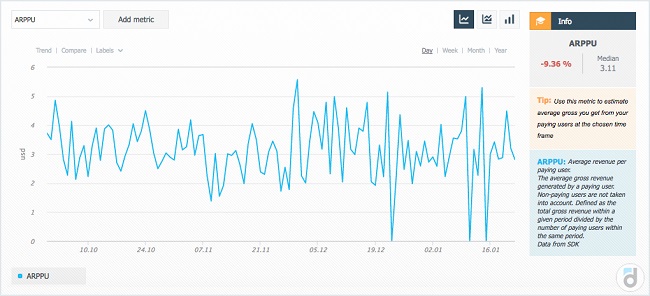
What questions do you have for this graph? I would have had the following:
-
what happened after November 7, when the revenue per paying user suddenly dropped lower than it used to be?
-
what was done in the last week of November, when the revenue rose again to its previous level?
-
why the revenue fluctuated so much in the last week of November?
-
why ARPPU was equal to zero for three days?
-
why each of the zero-day was preceded by the day with an increase in revenue per paying user?
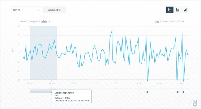
To answer these questions, we hold on a meeting with the analysts, marketers, and other heads of departments (spend, say 20 man-hours) to find out the following:
-
on November 7 the item was deleted from the store of the app, which we thought was not in demand;
-
but it turned out that it was in demand, so in the last week of November, we firstly brought it back and then planned targeted promo campaigns (and this explains the fluctuations in the graph);
-
in addition, we changed the server time three times, which is why all payments for three days (one in November and two in December) were moved to the day before.
Agree, it would be a bit easier if this information was listed on the graph from the very beginning.
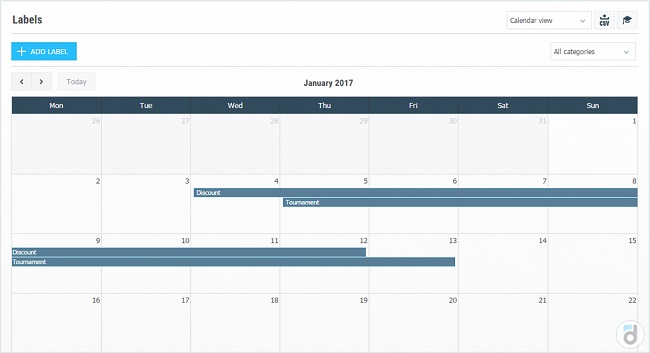
That is why we at devtodev developed Labels mechanism. It allows you to add different labels to the time axis of the graph.
In fact, working with product metrics comes down to monitoring deviations as quickly as possible, respond to them, conduct analytical investigations and plan updates of the product on the basis of previous changes in metrics. This is why the labels on the graphs are so important.
What labels could that be:
-
promotion;
-
new version release;
-
any event within the product (eSports tournament, for example);
-
in general, anything you want can be described by these labels.
Labels can be both point (we held a promotional campaign on January 21) and interval (we released a new version of the product on December 1 and the majority of users continued to use it till December 12, before the next version came out).
Of course, one day several kinds of labels may intersect. For example, we had experience of intersection in one day:
-
in-game tournament;
-
promotional campaign of 50% discount on the purchase of in-game currency;
-
release of the new version, in which the promotional campaign was set up and also some balance adjustments made;
-
A/B-test of the game tutorial.
Tracking the behavior of the game during each of these events, given the fact that they all intersect in one day is very difficult without the usage of time labels.
Labels can be simply used to tag each new release and track quality metrics (ARPU, cumulative 7-days ARPU, 1-day retention, 7-days retention, paying share) in the cut of versions on the time axis.
The usage of labels is really limitless, and we are sure that you will find this tool just as useful.
Analytics is an internal media within the same company and the success of the product depends largely on how the analyst will present the idea to his colleagues. The job of an analyst is to minimize the time between receiving the data (in any form) and taking a decision on its basis.
As we could see above, labels may significantly shorten the process and make the data more understandable.
P.S. With the help of labels it is also possible to build, for example, these graphs.


: The Basics")
: The Basics")


 in Mobile Games")
 in Mobile Games")


")
")


")
")


")
")


 Tactics for Mobile Games")
 Tactics for Mobile Games")


