
Meet our latest update: labels for dashboards, helping you connect the dots behind your metrics at a glance.
See the Full Story Behind the Numbers
Labels give you a clearer picture of how events in your app influence your core metrics, helping you make better, faster decisions.
Open your dashboard and instantly see what’s driving change. For example, if a drop in new users aligns with a paused acquisition campaign, a rise in retention matches the launch of a new onboarding flow, and fewer drop-offs appear right after a pricing update or promo.
No digging through reports or second-guessing: the context is right there on the timeline.
The best part? Labels for app releases are added automatically, so you can focus on insights without extra effort.
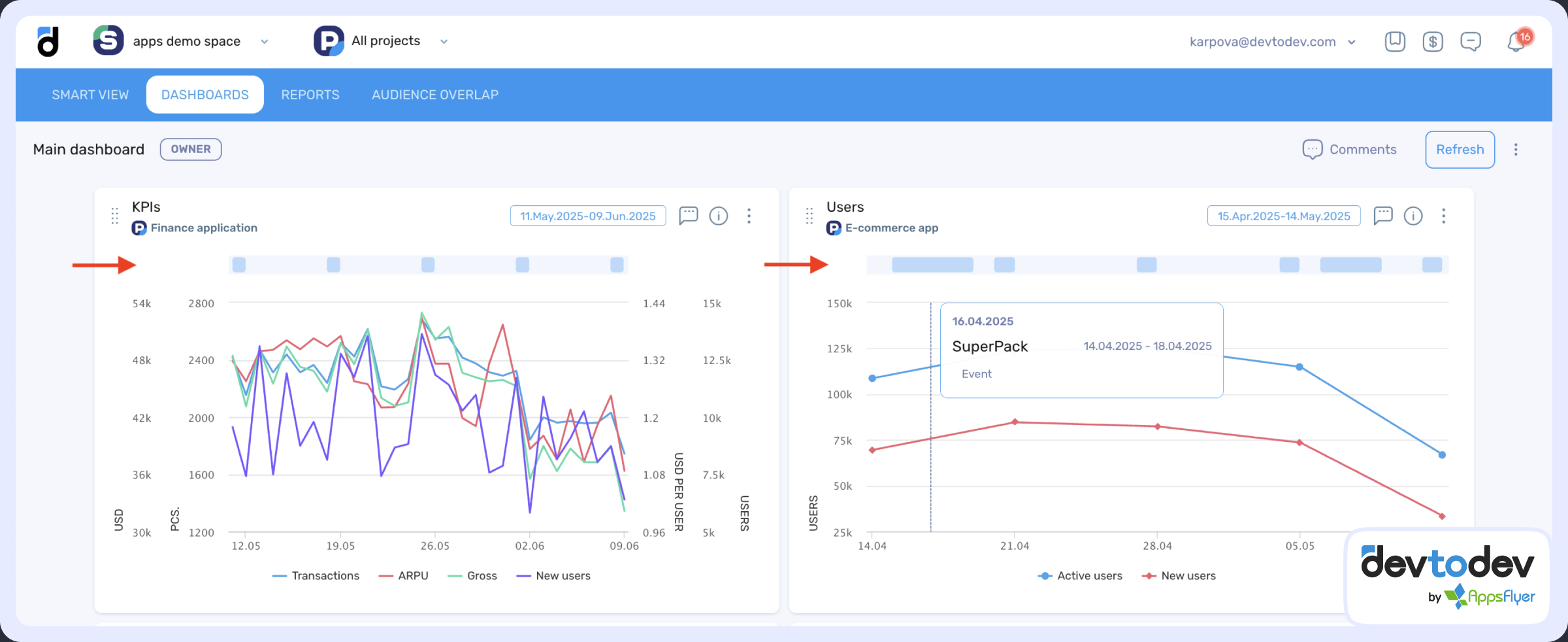
With this update, labels are available not only in the Basic Metrics report but also shown on your custom dashboards, even when grouped by week or month.
Let us know what you think!
Check out our demo to see how it works in action!